Archive for the ‘design’ Category
BBC Timeline
Filed under: design, history, public service media, tv | Tags: bbc, identity, logo, logo design, television, timeline, tv
 Leave a comment
 I’ve just been writing a concise history of the BBC (from a TV perspective) for Ravensbourne University and thought I might as well share the basic timeline online as it’s not easy to find on the web
- 18 Oct 1922 British Broadcasting Company formed by a group of leading wireless manufacturers (including Marconi)
- 14 Nov 1922 Daily broadcasting began in Marconi’s London studio in the Strand
- Jan 1927 BBC established by Royal Charter as the British Broadcasting Corporation
- Nov 1929 John Logie Baird tested television
- May 1932 Broadcasting House, Portland Place opened
- 2 Nov 1936 BBC Television Service launched
- Jan 1948 News added to the TV Service
- Jun 1960 Television Centre, White City opened
- 20 Apr 1964 BBC2 launches
- Jul 1967 BBC2 offers 1st full colour TV service in Europe
- Nov 1997 BBC News 24 Channel rolling news
- Dec 1997 bbc.co.uk launched
- Sep 1998 BBC Choice – 1st BBC digital TV channel
- 2 Mar 2002 BBC 4
- 9 Feb 2003 BBC3
- Jul 2007 BBC iPlayer
This first BBC TV ident was designed by my graphic designer mum’s mentor, Abram Games in December 1953. It acquired the nickname the “Bat’s Wings”. It was created using an elaborate mechanical model constructed by Abram, centred on a tiny spinning globe, surrounded by two spinning ‘eyes’, with electrical/lightning flashes to either side. The contraption was temperamental and broke down shortly after it was filmed. But he got the money shot.
Remembering Kristallnacht
Filed under: design, german, germany, history, Politics, Reflections | Tags: agfa, allianz, basf, bayer, berlin wall, brands, design, eric vuillard, german, history, ig farben, kristallnacht, logos, national socialists, nazis, opel, sanofi, siemens, telefunken, vauxhall
Comments (1)  The night of 9th/10th November 1938 was Kristallnacht in Nazi Germany. The Kristall/crystal part of the name refers to the broken glass from the smashed windows of Jewish shops, businesses and synagogues. Jewish homes, schools and hospitals were ransacked, damaged and destroyed. Over 250 synagogues and 7,000 businesses were attacked. 30,000 Jewish men were arrested and sent to concentration camps.
The event was widely reported, pretty much as it was happening, largely by foreign journalists working in Germany. With what impact is a moot point.
Kristallnacht was made possible by the support, funding and protection afforded the National Socialists by corporate Germany. Five years earlier (on 20th February 1933 at the palace of the President of the Assembly on the banks of the Spree in Berlin) 24 leading industrialists had attended a meeting with Hitler and Göring. In the wake of it they coughed up money and other support. In doing so they cleared the way for the rise of the Nazis and ultimately Kristallnacht and the Holocaust. This key event is brilliantly spotlighted in Eric Vuillard’s Prix Goncourt-winning novella (récit) The Order of the Day/L’Ordre du Jour.
The brands at that meeting included:
- Allianz – the insurance and financial services multinational which sponsors the stadium of our local rugby team, Saracens
- Opel – their cars are now sold in the UK under the Vauxhall brand – they’re even sold in Israel, under their own name
- Bayer – the multinational pharma company with the motto “We exist to help people thrive” – wrong people in 1933
- BASF – whose tapes I used to use to make mixtapes as a teenager
- Agfa – whose film I used to use as a budding teen photographer
- Siemens – the multinational manufacturer with the motto “Ingenuity for life”
- IG Farben – broken up after the war on account of having supplied the gas for the gas chambers among other evils – the main successor companies are Agfa, BASF, Bayer and Sanofi (motto: “Empowering Life”)
- Telefunken – a tellies and hifis name from my youth
So the brands (and their logos) long outlived the Jewish businesses with the broken shop-windows, the people who ran them and the congregations that filled those synagogues.
A great irony is that another sledgehammer wall smashing event took place in Germany on 9th November – the fall of the Berlin Wall in 1989.
The evolution of an eagle-based logo
The Eagle has Landed
Nazis loved eagles too – this eagle is looking the other way
Blitzkrieg means lightning war

Nazis loved lightning too
A cross-based logo (1904)
The cross has persisted
A cross-based logo – Hackenkreuz (= hook cross)

IG Farben (which created bad chemistry) morphed into BASF among others
IG Farben dissolved after the war

An IG Farben Luftschutz helmet – oddly familiar
Another recipient of IG Farben
Life?
Life? Another recipient of IG Farben

Lightning strikes thrice
Typographical London
Filed under: design, london, photography | Tags: alphabet, design, letters, london, photography, typography
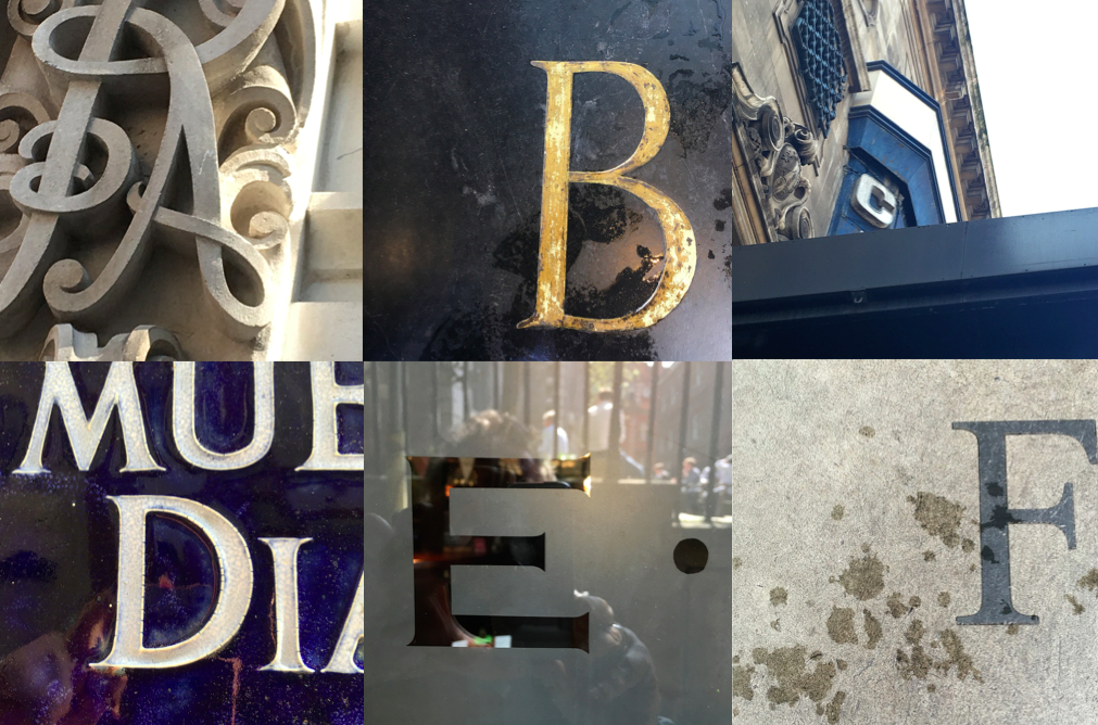
Comments (1) On my flannage around London yesterday I decided to play a little photographic game – inspired by the Z (as in Ritz). These were gathered between Moorgate and Piccadilly, via St Paul’s and Temple. Can you recognise where any of these come from?


Superhumans v Ability
Filed under: advertising, channel 4, design, Reflections, sport | Tags: channel 4, david weir, disability, ellie simmonds, paralympics
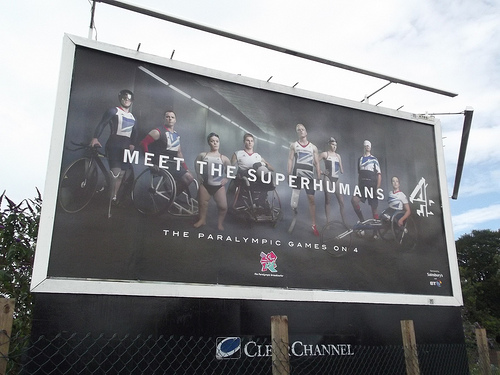
Leave a comment On the day of the Opening Ceremony of the Rio Paralympics, it’s interesting to contrast the UK television marketing of London 2012 vs Rio 2016

2012: Meet the Superhumans


2012: the week between the Olympics and the Paralympics


2016: Ability

Not to be confused 2
Filed under: advertising, design, Reflections | Tags: logos, supreme
Leave a comment Spotted by Noah Gee

![]()


Not to be confused
Noticed this in a bathroom this morning

![]()
BBC3 logo
Filed under: design, Reflections, Television | Tags: bbc3, ID, logo, logos, maker, maker studios, online video
Leave a comment I’m just about to go to Farringdon for a meeting at Maker Studios and noticed while preparing that there isn’t much clear blue water between the logo of Disney-owned Maker and the new BBC3 logo announced earlier this month. What makes the similarity particularly striking is that in many ways the two organisations are now direct competitors with both’s emphasis on online video.


New BBC3 logo

I have a vague memory of seeing something like this as an earlier version – I heard there was a last minute failure of nerve at which point the ! appeared
Trigger Happy
Filed under: books, design | Tags: anthony horowitz, bond, book covers, ian fleming, james bond, trigger mortis
Comments (2) So back to Trigger Mortis. The question was: Is the cover superior to the content of the new Bond book by Anthony Horowitz? I ended up reading it as a double bill with Fleming’s own rocket book Moonraker. So that’s this one, set in 1957 and published in 2015:

versus this one, set in 1955 (I think) and published in 1955:


Somehow Trigger Mortis fails to capture the essence of Bond – it lacks his hard brutality and the underlying S&M going on in Fleming’s books. The cover wins out in the end. Though even the cover loses out to echt Fleming. The flame cover of the Jonathan Cape 1st edition of April 1955 was conceived by the author. The Pan ones are charming version after version.


This is the edition I read, picked up at Black Gull Books, East Finchley. A nice phallic rocket and a slightly naughty underwear shot (resonant of the beach skinnydipping scene with Gala Brand under the virgin white cliffs of the Kent coast).

For anyone else who embarks on Trigger Mortis, and don’t get me wrong it’s an entertaining enough read, there are a couple of fine machines towards the climax which are worth following up. First of all the Triumph Thunderbird 650cc on which Bond and the heroine Jeopardy Lane chase the baddie into the centre of New York City.

Triumph 6T 650 cc Thunderbird (1950)

Triumph Thunderbird (1962)
The baddie meanwhile is hurtling along on the R-11 subway train, the so-called ‘Million Dollar Train’. As Horowitz explains, “they had caught the spirit and dynamism of the (post-war) age.”


Bond is a world of style and glittering surfaces, the right motorcycle and subway carriages as much as car, watch or booze.
Trigger Mortis
Filed under: books, design, literature | Tags: anthony horowitz, book covers, books, covers, frank kane, ian fleming, james bond, novels, short form video, thrillers, titles, trigger mortis
Comments (1) Apparently I registered with WordPress 9 years ago today. How time flies. I’ve got to fly myself now (to Bournemouth to drop off Enfant Terrible No. 1, which is a far more important landmark) so this is a quickie to reflect on the statute of limitations on titles. I’ve written before on the importance of titles such as in Starless and Bible Black.
Any way, it looks like 56 years is the statute of limitation in the world of Anthony Horowitz / James Bond / The Fleming Estate. The title of the new, just published Bond book is Trigger Mortis. The book below was published in 1959 and it’s also a thriller.


By the looks of things, the covers are far superior to the contents. Whether that’s the case with the new Horowitz book, I’ll find out soon as I broached it last night. Its cover is well designed and cool but not much fun, promising something very different to Frank Kane and Johnny Liddell. The title’s crucial. and so is the cover/image. That applies equally to other media such as the one I’m currently focused on: Short Form Video.

Film Critic Sandwich (Day 84)
Filed under: design, punk, Reflections, writing | Tags: alf garnett, bafta, buzzcocks, fresh meat, graphic design, Linder Sterling, malcolm garrett, mark kermode, peter saville, rupert graves, sherlock, silver linings playbook, una stubbs
Comments (1) 
Linder Sterling collage
A big BAFTA day today – not so much for the film award nominations which were announced this morning, which were pretty predictable, although why American Hustle is doing so well baffles me (and I’m a big fan of Silver Linings Playbook), but for the fact I had a very interesting and enjoyable day working there. On arrival at 195 Piccadilly I had a lovely chat with Mark Kermode – we know one another from school but haven’t met properly for ages, since I was doing some film reviewing after leaving university and we crossed paths at movie screenings. He was sympathetically encouraging as he explained how long it took him to write his three books in terms of words per month, which went over my head a bit as I haven’t been thinking in those terms (deliberately).
From the off I ran across a variety of colleagues, some ex-Channel 4, most C4 related, from the producer of Fresh Meat to a former Head of Interactive at the Channel who kindly offered an intro to a literary agent. So a jolly time all round.
Work began with an interview of the super-talented designer Malcolm Garrett, close friend of Peter Saville and fellow graduate of the Manchester Post-Punk scene, who came to prominence through his fresh designs for the Buzzcocks record sleeves. The record that got me into Punk was the Buzzcocks What Do I Get? single (which sadly did not have Malcolm’s sleeve on it when I bought a copy at Smiths in Chichester, but which lead me to his beautiful silver and day-glo orange cover for their Another Music in a Different Kitchen LP which I got given that Christmas). We talked about Tony Wilson and Factory, with whom he worked and hung out a bit, and about the prospects for creatives from the North and regions, a lovely wide-ranging interview-cum-chat.
Then back to the writing where, having taken my only working day away from it since starting on 1st September yesterday to do some personal admin etc., I had a bit of a break-through in terms of structure. Material I had been planning to integrate into the case studies I now realise would be better and more easily included interleaved between the chapters. I came to this realisation when I went back to add to the short intro I wrote a while back. The argument of the intro was tight and didn’t allow for any insertion without breaking the flow so I tried the additional material I wanted to insert as a short piece between Chapters 1 and 2 and that worked, so I am now going to site all the contemporary and personal reflections between chapters not woven into them. This will keep the narrative flowing and clear and avoid any confusion of timeline.
Next up was a meeting about one of the spin-off projects and then I headed for home. As I walked down the stairs I passed Inspector Lestrade (Rupert Graves) on the landing and then Mrs Hudson herself (Una Stubbs), who was so polite that she was worried she had pushed in front of me when I was having a quick conversation with one of the receptionists. The days of Alf Garnett and Rita Rawlins are clearly long gone as she appears very much like Mrs H incarnate. I deduce some Sherlock event was going on.
When I got off the tube I bumped into Bob McCabe, author of Harry Potter: Page to Screen, co-writer of The Python’s Autobiography and a bunch of Monty Python related titles. He’s just launched a new movie-related site The Last Word on Earth. So the day has a pleasing circularity.

design by Malcolm Garrett


